


Pantone did something different for 2021: there are two colors of the year.
The color industry expert chose “Ultimate Gray” (17-5104) and “Illuminating” (13-0647) yellow as the colors of 2021. In a tone that matches how many people feel looking toward the new year, Pantone described the colors as “A marriage of color conveying a message of strength and hopefulness that is both enduring and uplifting.”
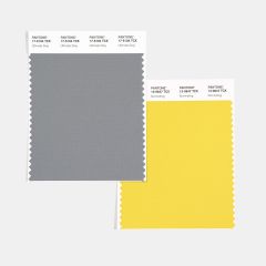 This is the first time an achromatic color has been chosen, and only the second time Pantone has chosen two colors to share the Color of the Year.
Branding conveys a lot about your brand to your consumers, and like many trends, specific brand colors and styles will go through phases of popularity. As Pantone is an authority in the color world, after the color is announced, it’s typical to see the color appear in everything from trend forecasting and designer fashion lines to consumer goods and promotional materials. Color association is a psychological effect that means different colors and their environment elicit specific emotions in humans. This is one way choosing brand colors is fundamental to ensure your company emotes the intended vibe.
Colors go through trends, and what is considered “modern” is constantly evolving. The colors of yellow and grey individually and the combination of the two will gain popularity in the next couple of years. The brands that already have similar colors can be considered cutting-edge and ahead of the curve.
Let’s look at the brands who got it right:
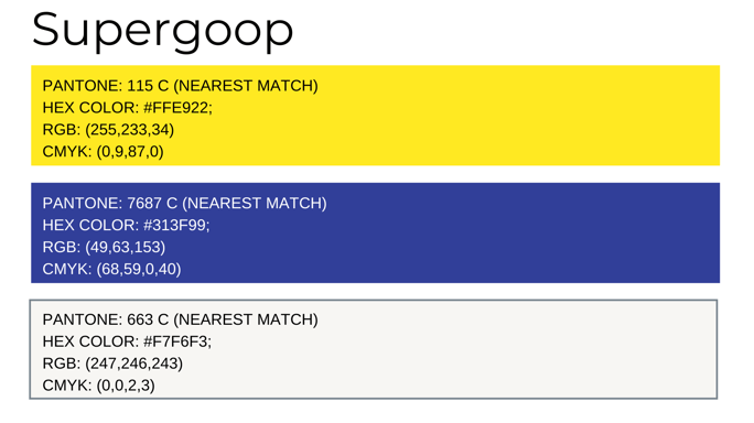
Best Brand Feel: Supergoop
Supergoop is a skincare company that stresses the importance of SPF and taking care of your skin. The brand uses a bright yellow, one of the three brand colors, typically as an accent color and in the backgrounds of product photos. The yellow paired with their navy-blue branded color convey a feeling of bright and sunny atmosphere that reflects their brand values. Supergoop uses a silver-grey in the product details and description on the packaging.

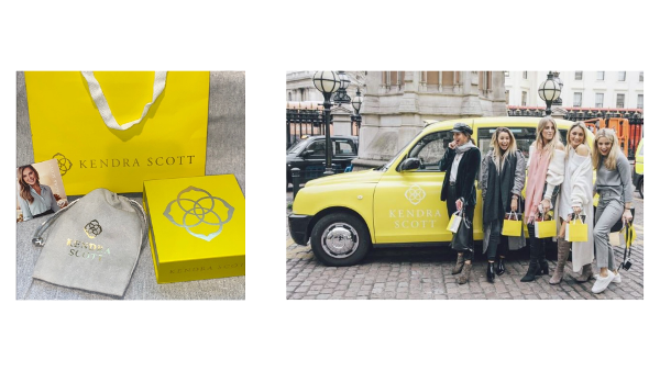
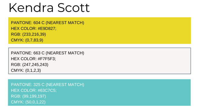
Most Recognizable: Kendra Scott
Kendra Scott is a contemporary jewelry company that is known for geometric shapes with stone and crystal inlays. The yellow and grey Kendra Scott uses in packaging are a crucial element of Kendra Scott products. Their color is so well known that the brand even uses the tag line “Good things come in yellow packages” and even branded (typically black) London cabs yellow when the company expanded product offerings to England. Yellow is used on packaging and as the primary logo color. Grey is used as an accent color in packaging and for the color of the jewelry bags, included with purchases.
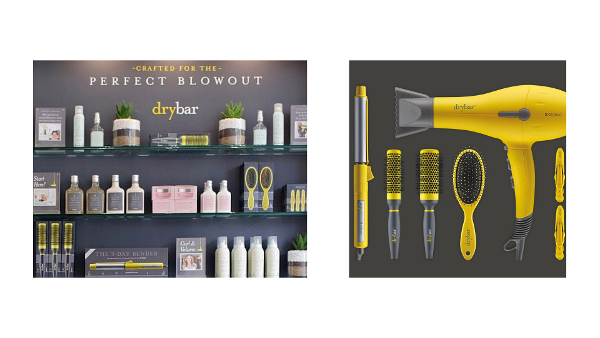
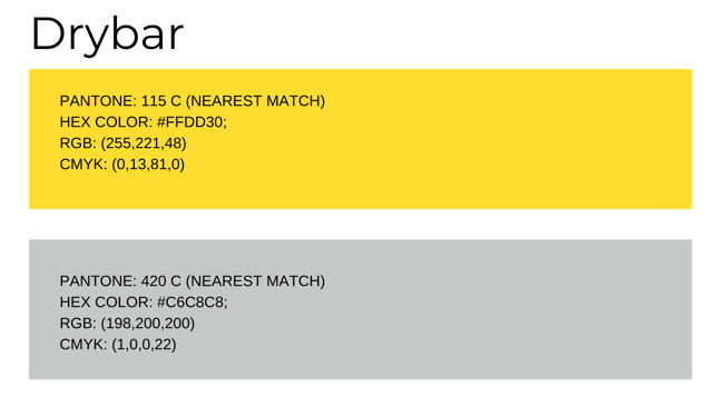
Best Match: Drybar
Drybar has a unique business because they have salons with blowout services as well as hair tools and hair care products. The brand’s logo features a yellow “dry” and a light grey “bar,” which are probably one of the best patches with the colors Pantone chose. Drybar is known for having a very sleek, modern feel, with the brand colors combined with their typography accomplish.
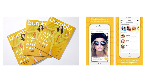
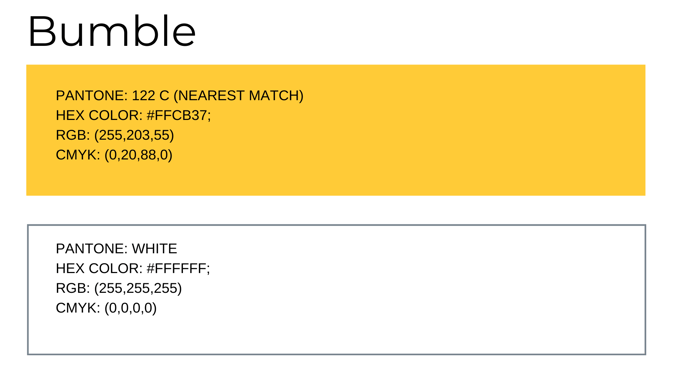
Most Out-Standing: Bumble
Bumble’s branding helps it stand out from its competitors. Bumble is an app for connecting with other people. It started as a dating app that focused on women’s choices to speak to matches first. The app now offers Bumble Bizz and Bumble BFF, which gear user connections towards professional networking or finding friends. Bumble uses a more golden yellow than the one represented by Pantone. The gold and white brand colors relate to their “bee-themed” app. They use the yellow in the app icon, in pieces of the app interface, and in branded materials. Typically dating apps use red to signify love or blue to elicit feelings of security or trust. Bumble uses its bright branding to contribute to its fun bubble brand personality and stand out from the crowd.
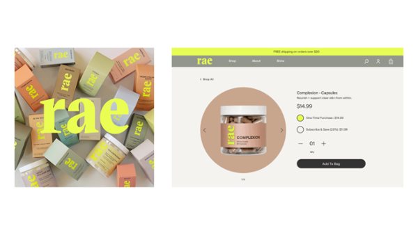
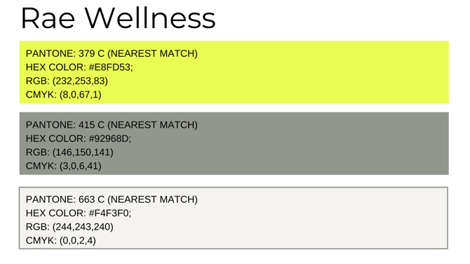
Honorable Mention: Rae Wellness
Rae Wellness is a supplement brand that uses high-quality ingredients to support the overall well-being of women. Its primary brand color is a bright green that borders on yellow, very similar to Pantone’s illuminating. The brand sometimes uses a combination of a light and medium grey as well, particularly on their website. However, it uses a range of earth-toned colors paired with the bright neon color in the logo on most of its products. Using a different color per product helps consumers identify a piece of merchandise easier. The juxtaposition of the colors reflects the brand’s young, energetic, but simultaneously down-to-earth personality.
How to Better Your Brand
Cohesive branding helps your company stand out from the crowd. Your brand should be recognizable beyond just the logo. You want to showcase your brand in product packaging, hang tags, shopping bags, signage, and on your website. Customers should be able to distinguish your brand and what it represents from just one of those elements.
For professional and creative branded assets and design solutions, a creative printing agency, such as HBP can level up your branding efforts. They specialize in direct mail and packaging, signage, and displays to help your brand stand out in advertising, in-store, or on the shelf.
At Virid, we can help you create a cohesive and high-converting website highlighting your brand and what it stands for. We understand that your web presence is just as significant, if not more, than your physical storefront. We focus on customized solutions for developed ecommerce retailers.
Let us know how we can help you improve your website branding!